

Brand Identity | Brand Strategy | Stationery Design | Packaging | Facade Design
El rediseño de Go Pechugas parte de una intención clara: transformar una marca en una experiencia cálida, cercana y altamente franquiciable.
Tomamos como base los códigos visuales del fast food clásico y los reinterpretamos desde una mirada contemporánea, incorporando guiños al México popular y una sensibilidad gráfica más ligera y expresiva. El resultado es una identidad que se siente familiar, pero con personalidad propia.
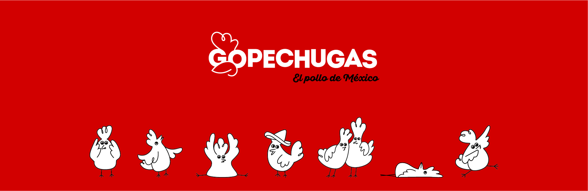
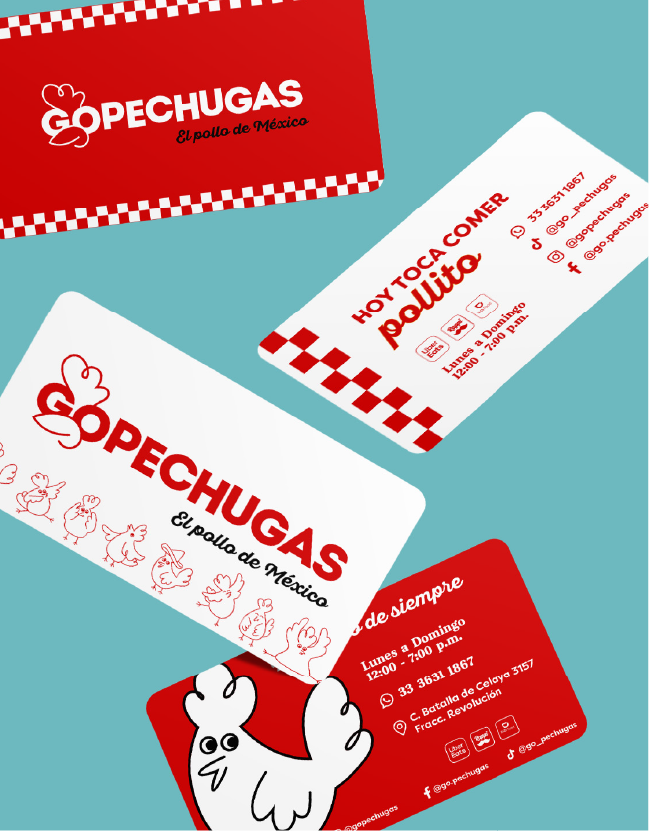
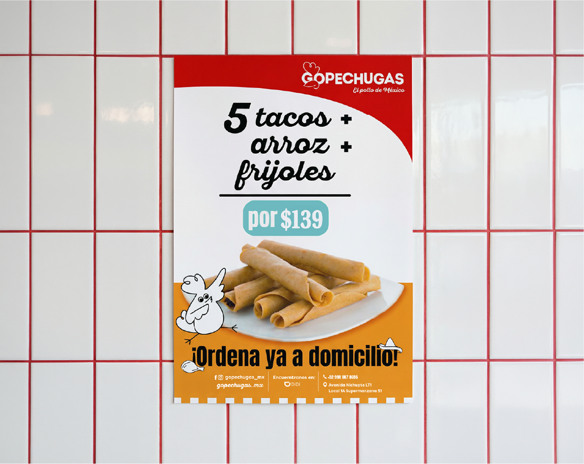
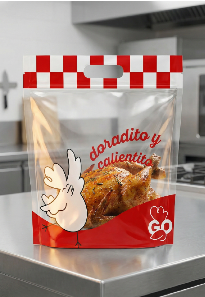
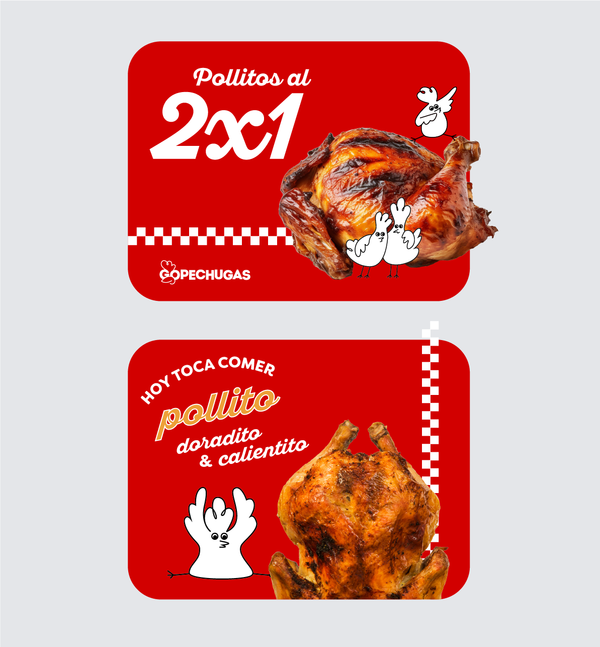
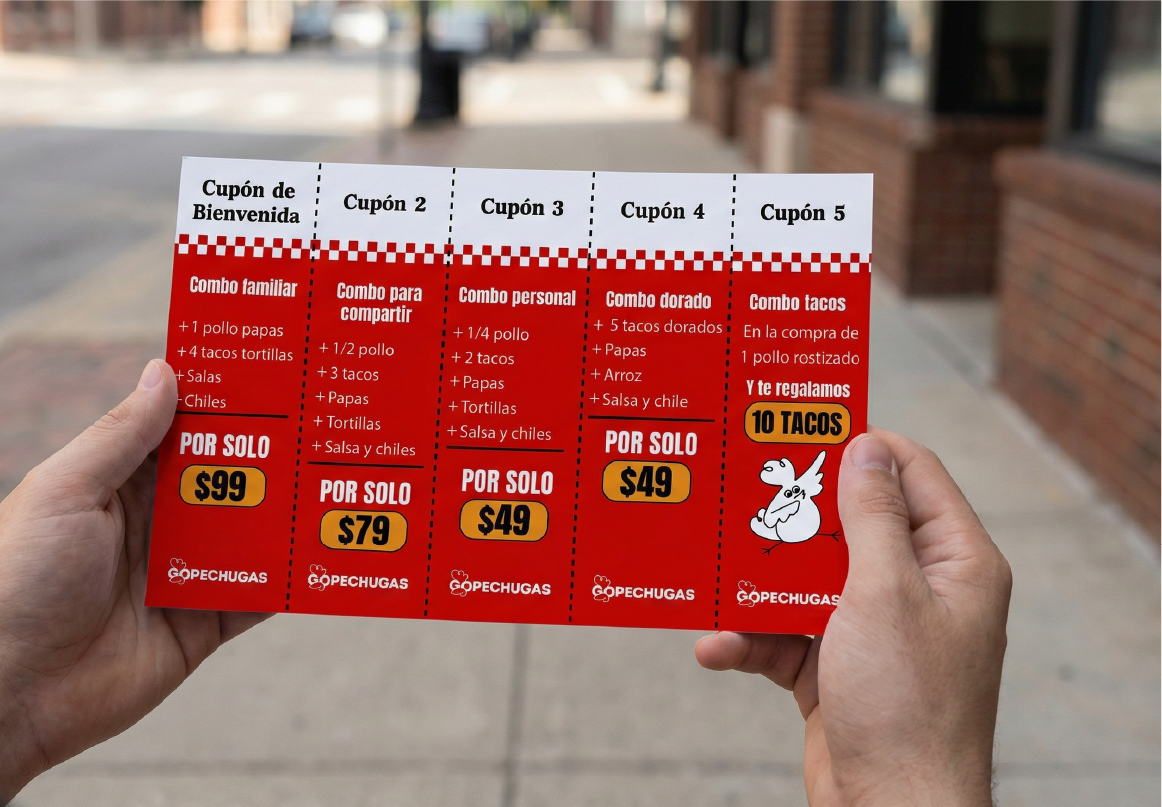
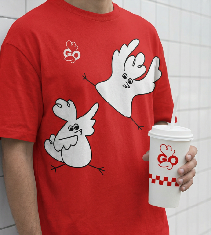
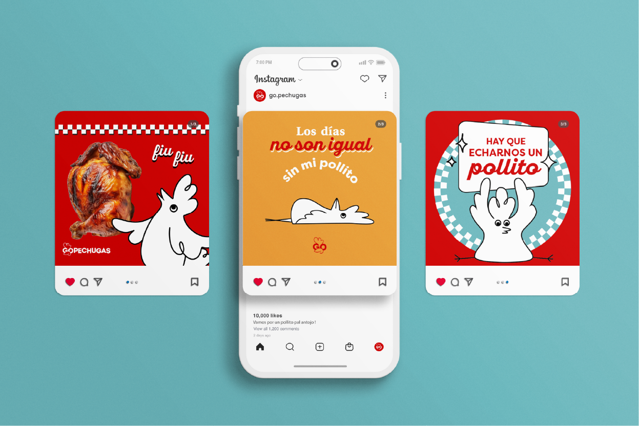
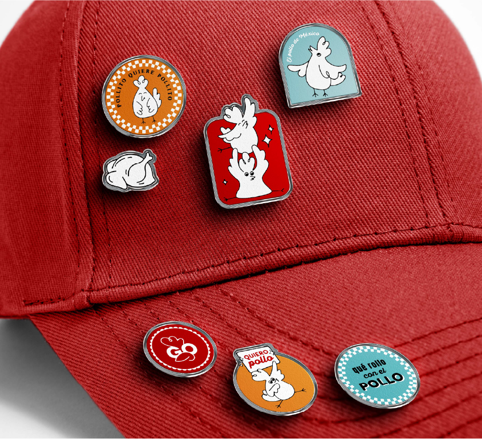
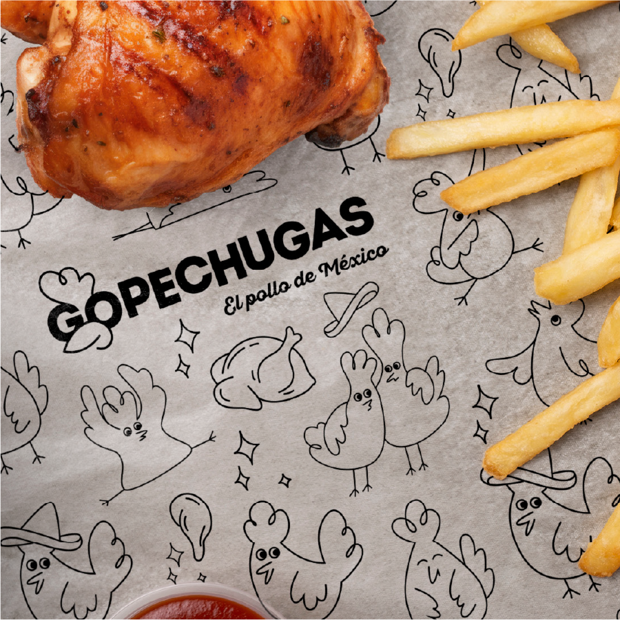
El sistema gráfico se construye a partir de formas simples, ritmo visual y una paleta vibrante que transmite energía sin perder claridad. Las ilustraciones —estos pollitos traviesos— se convierten en el corazón de la marca: aportan cercanía, memorabilidad y un tono lúdico que humaniza la experiencia.
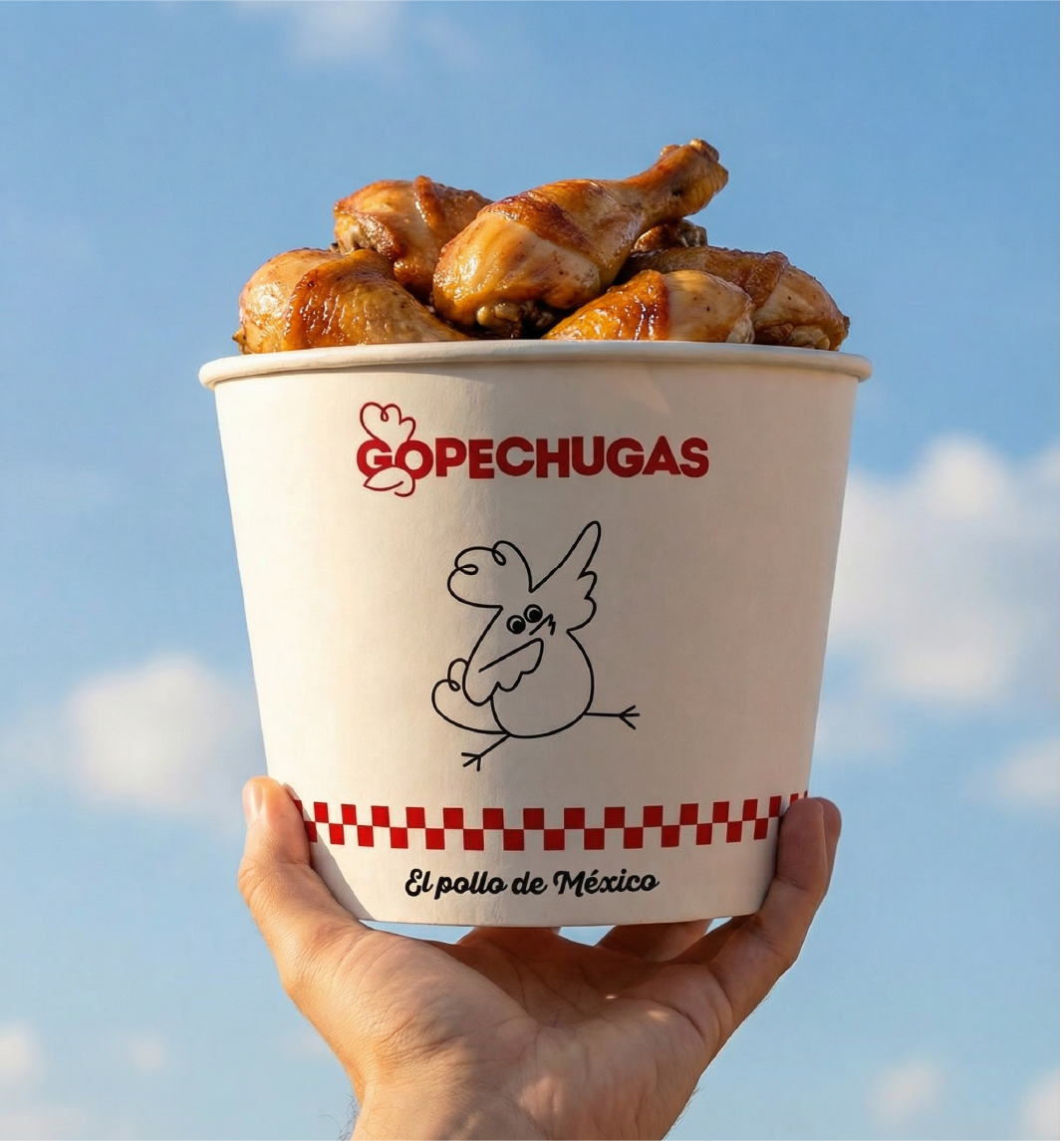
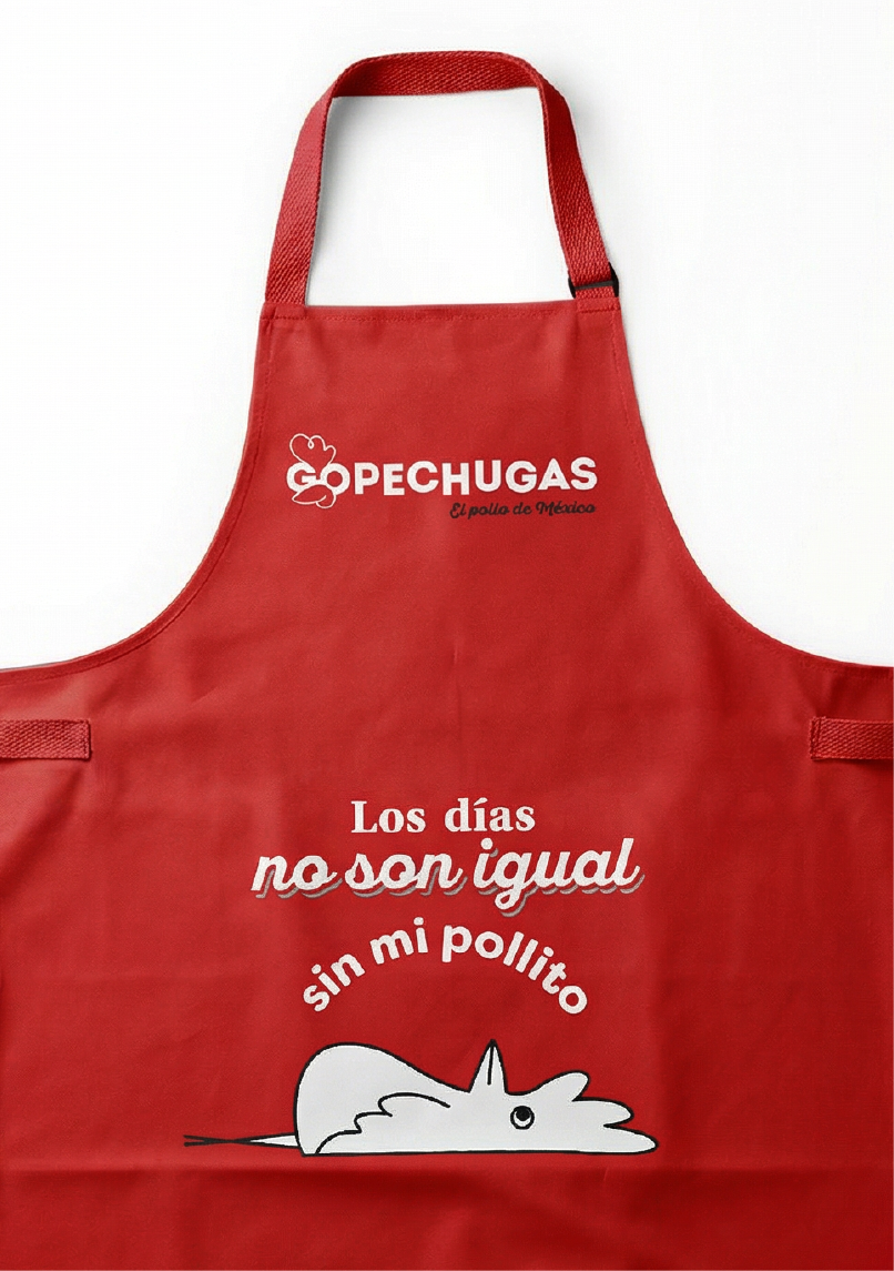
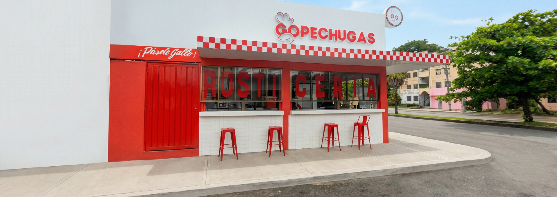
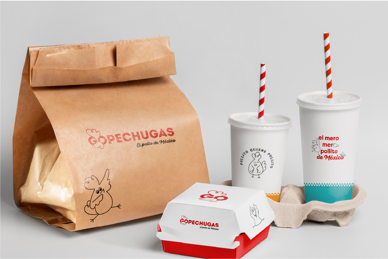
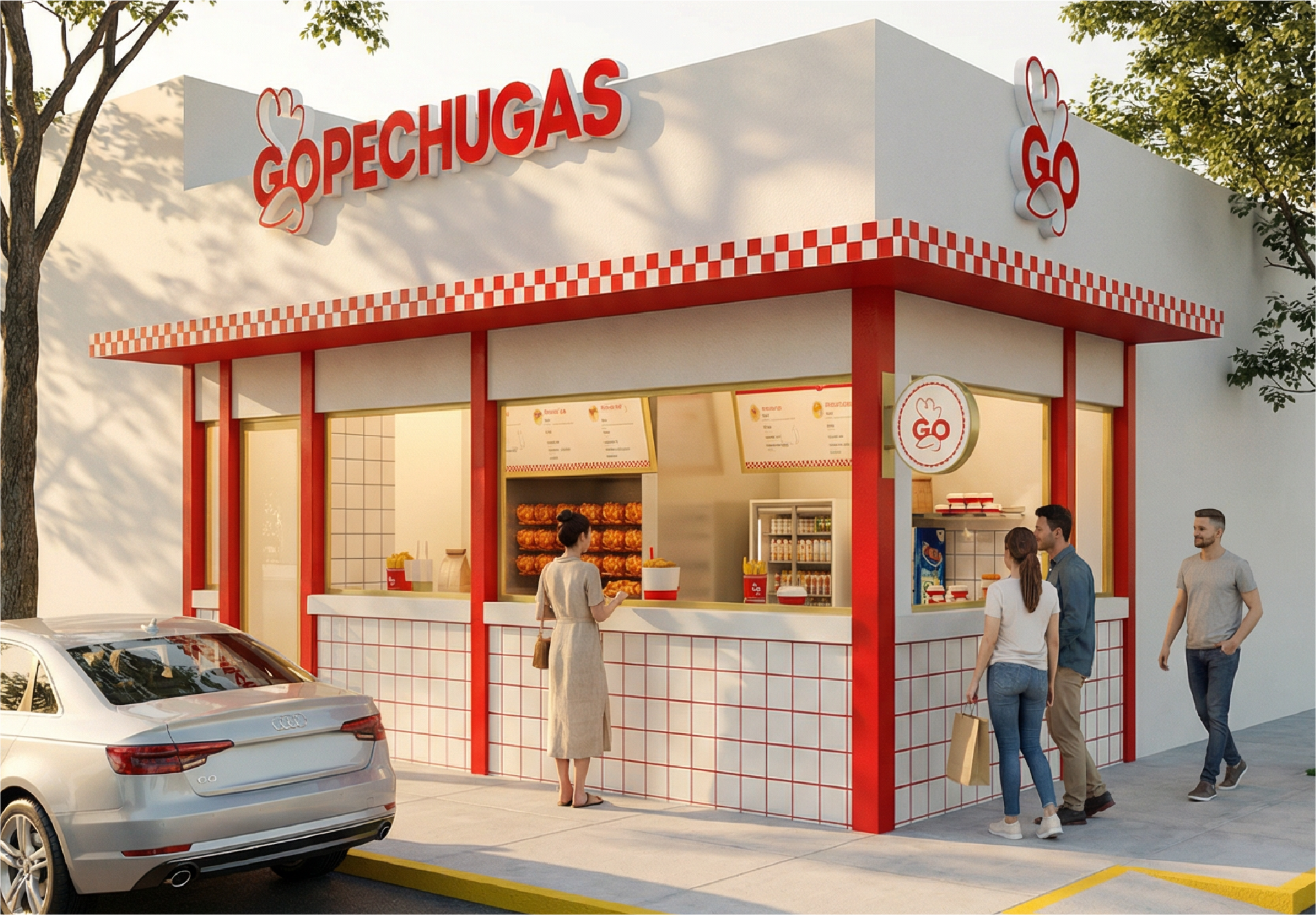
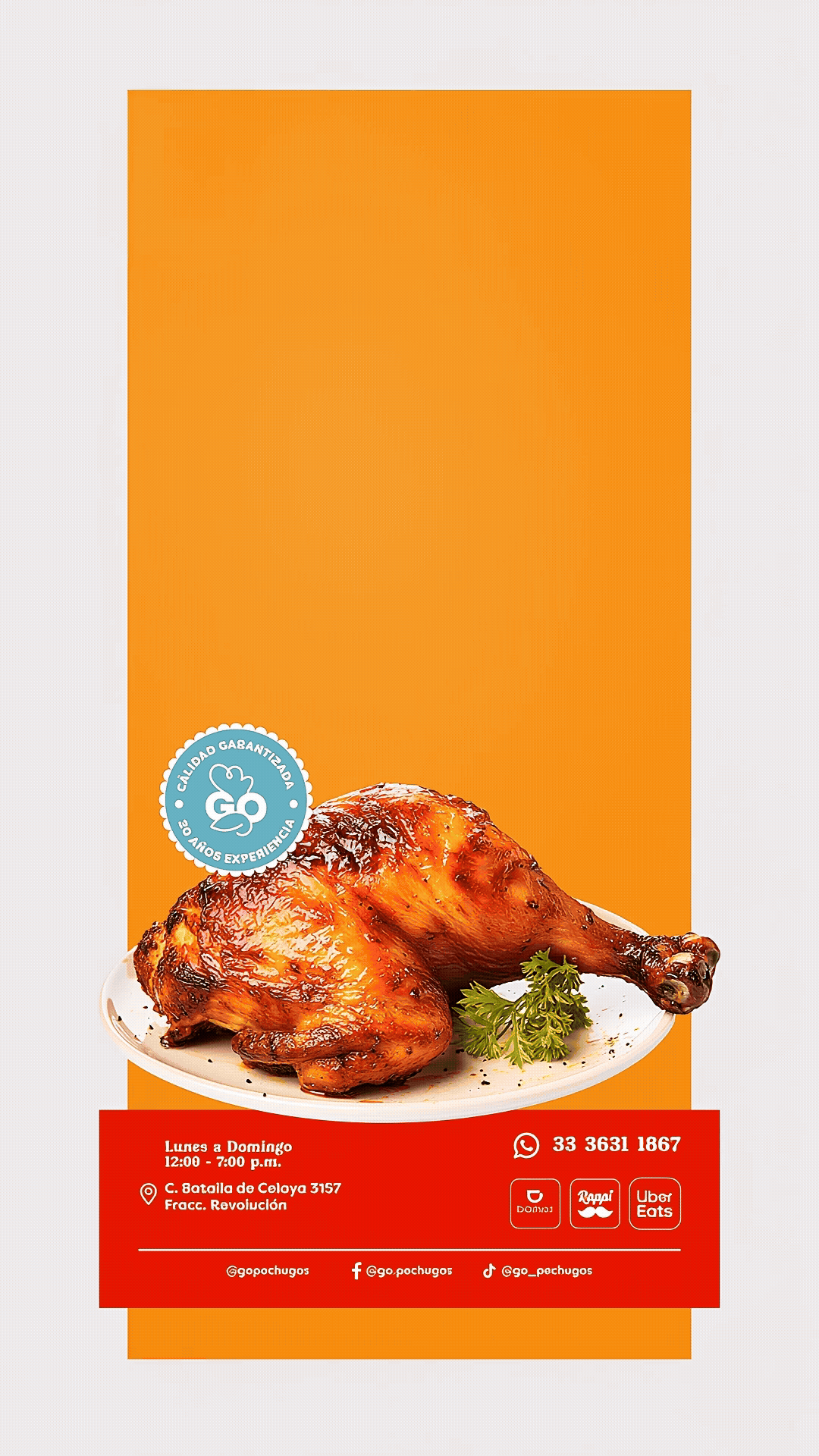
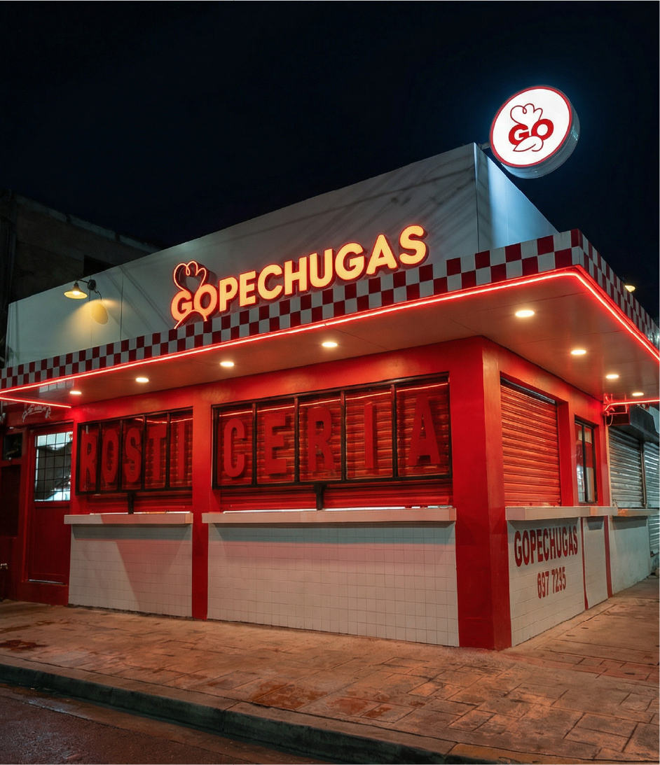
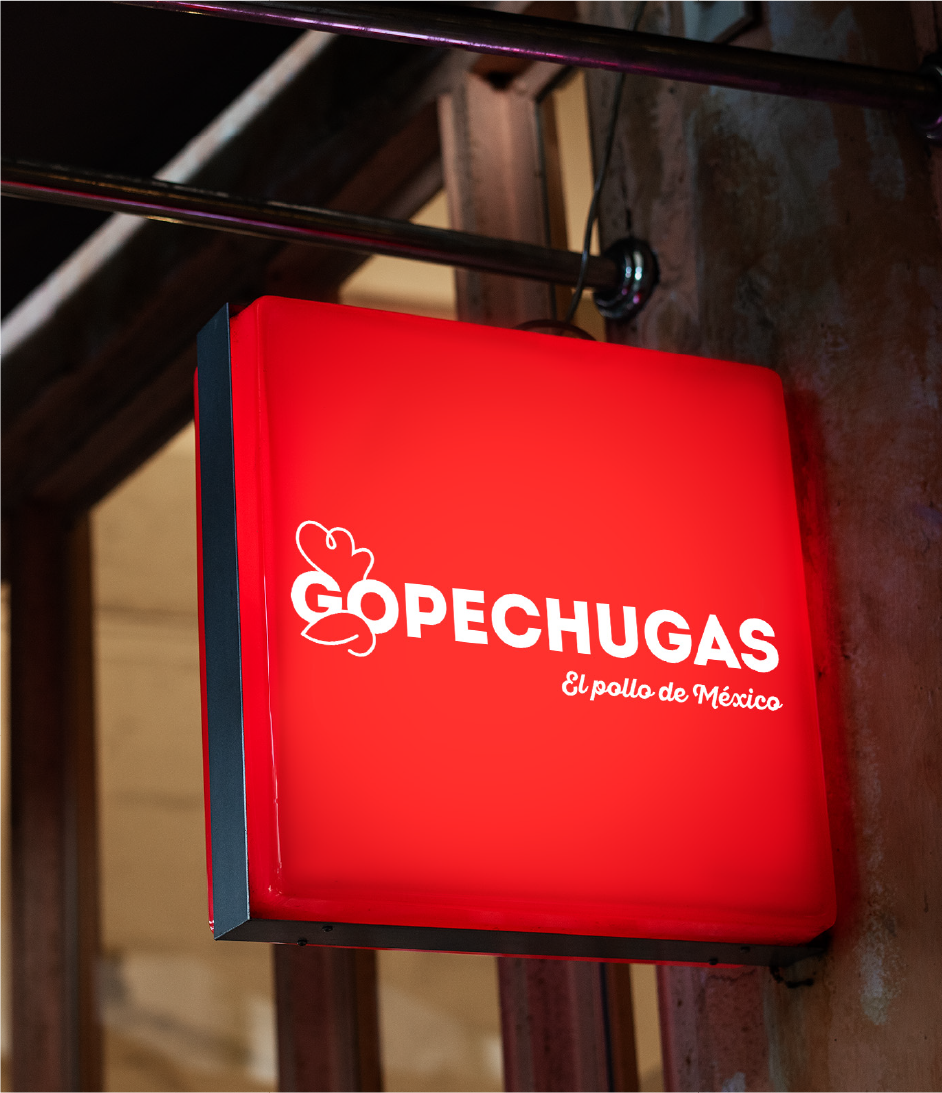
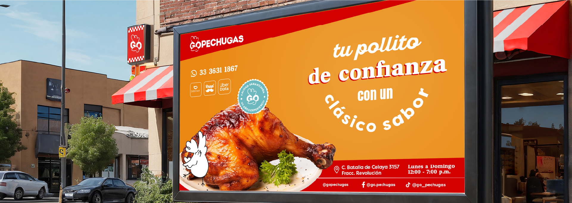
Más que un logotipo, desarrollamos un universo visual completo que vive en cada punto de contacto: desde aplicaciones gráficas hasta el espacio físico. Una marca que, aunque nueva, se siente como ese lugar al que siempre quieres volver.
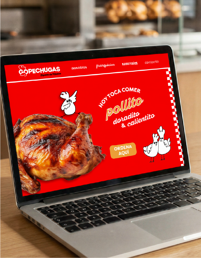
The rebranding of Go Pechugas began with a clear goal: to transform a previously aggressive and masculine identity into a warm, approachable and highly scalable brand.
We drew inspiration from classic fast food visual codes and reinterpreted them through a contemporary lens, incorporating subtle references to Mexican popular culture and a more expressive, playful graphic language. The result is a brand that feels familiar, yet distinctly unique.
The visual system is built on simple forms, strong rhythm and a vibrant color palette that conveys energy while maintaining clarity. The illustrations —these playful chickens— become the heart of the brand, adding personality, memorability and a human touch to the overall experience.
Beyond a logo, we developed a complete visual universe that extends across every touchpoint, from graphic applications to the physical space. A brand that, even if new, feels like a place you’ve known forever.